
A complicated way to simplify home improvement
The original idea for MyLowe's was to be an authenticated user space where the Lowe's customer could customize their shopping experience and improve their home improvement knowledge through various tools, such as Reminders, Projects, Tasks, and even a room-building tool that could store dimensions and products in an organized and helpful way.
Using Reminders, a user could be notified when it was time to replace a refrigerator water filter, or an air filter, and what size/brand is recommended for use. They would also be able to set up Project folders in MyLowe's that would allow them to store products, images, how-to videos, tasks, dimensions, and budgets that would help them begin, track progress, and complete their home improvement projects. This required a variety of very powerful online tools to be available at the users' fingertips, while still being simple enough to not be intimidating to the average homeowner with mid-level savvy.
“MyLowe’s would allow [users] to store products, images, how-to videos, tasks, dimensions, and budgets to help them begin, track progress, and complete their home improvement projects.”
However, our numbers showed that usage of MyLowe's was much lower than expected. Our brick and mortar stores were encouraging customers to sign up for a MyLowe's card, which would allow them to keep track of their purchases online and in-store, and they were successful in achieving one million initial signups, but when it came to actually using the tools and features available in MyLowe's, usage was disparagingly low. Customers were eager to sign up for a MyLowe's card at point of sale, and would go home to register the card online, and they even continued on to see their purchase history, but after that, the interaction metrics tapered off significantly:
The first task would be to reorganize the taxonomy of the MyLowe's experience in a way that made sense to users. MyLowe's was launched with a disconnected and unorganized flow that was confusing to users, and we knew we needed to reorganize the entire experience in a way that mirrored the physical process of project management that homeowners currently employed. So Lowe's sent me to Athens, Georgia with a research partner to do in-home interviews with real users of MyLowe's and talk to them about how they use MyLowe's, how they approach home improvement projects, as well as do a design session with them to sketch out flows and screens based on their feedback.
User Interviews
Though there were some foundational similarities, it was interesting to see how differently each sketch session turned out. Each participant was describing the same features when talking about the tools they would need, but they all used different terms, and wanted to see it presented in different ways. While one user wanted to see things grouped within each project, while another user would rather see all their inspirational photos grouped together, regardless of the potentially associated project. Some users envisioned robust website layouts, while other users visualized more simple iPhone or tablet apps, so that they could have these tools readily available when working on a home improvement project.
“While interviewing MyLowe’s users, we realized that they didn’t differentiate between the dimensions of their house, their projects, the items in their house, inspiration, maintenance, or their task lists; they were all inter-related. All these components were pieces and building blocks that made up their home, not separate ideas.”

So based on the findings we gathered through four 3 hour sessions in Athens, we went back to the drawing board, and applied what we learned.
Sketch Session and Taxonomy Brainstorm


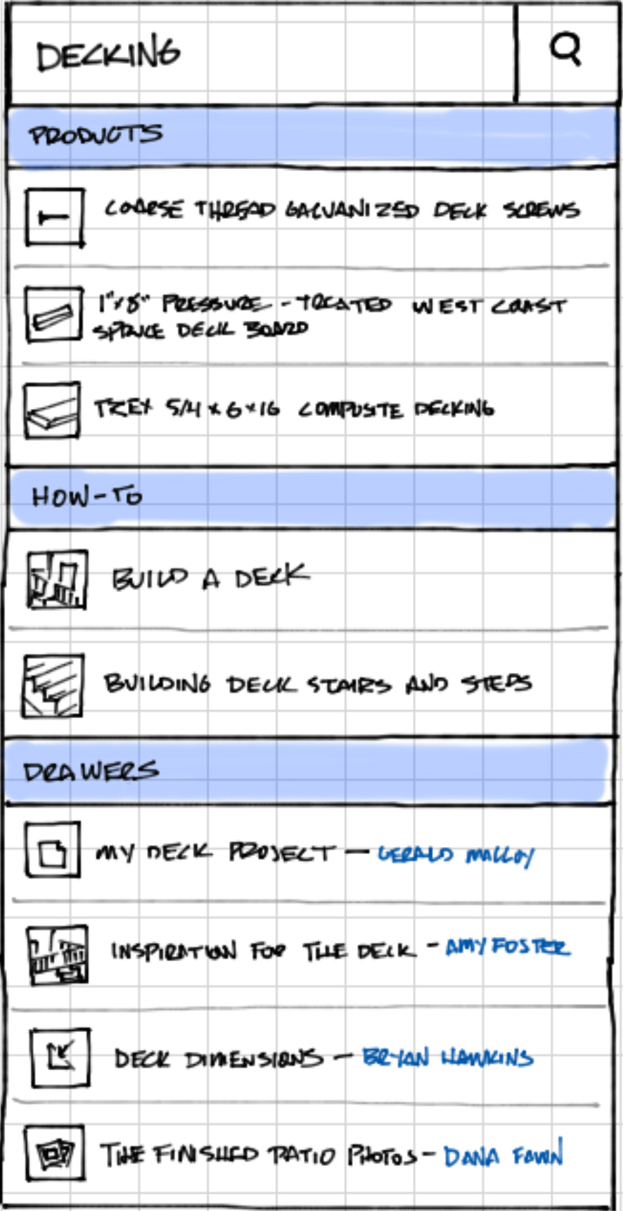
We began sketching concepts based on the fact that we found that users wanted to be able to add the things they collected for their project into buckets that they could label for themselves. We used the name "drawers" for the sake of this exercise, but the important thing was that users could call these collections whatever they want, depending on if it was a large project, a small project, a collection of only paint swatches, a collection of ideas for their backyard landscaping, or a woodworking project.
Search functionality
We approached the scenario with the intent that we wouldn't force anyone to use the components that we thought were necessary, but rather, let the users tell us which tools they needed, and then hide the rest until it became useful. So, if they needed a measurement calculator, it was available to them, but if they didn't need to record tasks because it was simply a folder full of inspirational photos, we wouldn't force them to.
We also wanted to allow the ability for quick searching and sorting, so we designed a set of simple tags the users could add, so that they could categorize the items they added to a drawer even further.
A user could either click one of the filters and toggle it on or off, or they could type into the search box and see an organized live search of their drawers, the commerce website, and how-to videos.
We found that some users didn't always want to start from scratch on their projects, but would be interested in seeing which materials other homeowners used in their home improvement projects so that they could have a point of reference for starting their own projects. So we built in a powerful social aspect where a user would be able to search for other drawers that are similar to their project based on keywords and contained products, and could copy that project to their own set of drawers.
Users would also be able to follow and interact with other MyLowe's users who had posted public projects to see what new projects they're undertaking, and be able to tag them in comments on the commerce site or inside projects to alert those users to products, articles, or projects that might be of interest to them.
Design Comps
Now that we had found a flow and taxonomy that seemed to make sense, and a system that had enough guidelines to help the user along, but was flexible enough that they wouldn't have to learn to do things our way, it was time to design comps to reflect the sketches I did.


What I learned
If people aren't doing it in real life, they won't do it online.
No one will use a feature on a website unless it's a better version of what they're already doing in real life. People don't write down the size of their lightbulbs in real life, so they didn't want to do it in MyLowe's.
Adopt the user's vernacular, don't make them use yours.
If someone stores their inspirational photos, receipts, notes, and paint swatches in a physical "folder", they won't understand if you make them store those things in a "list" online. And if you make them learn how to categorize their content based on what you think it is, you will make it harder for them to get started. Let them use their own words and they'll be much more likely to use your service.
Training wheels provide confidence, but don't grab the handlebars.
There is a delicate balance between ambiguity and complete control. Test participants were intimidated by a blank slate, but they were confused when walking into a completed equation. Users want a little bit of guidance to make them feel comfortable, so you can show them examples, but they have very little tolerance for being forced into a model they don't understand. Gently point them in the right direction they need to go, and then let them use your product however they see fit. Even if it's not what you originally intended.