
Designing the new face of home improvement.
During my time at Lowe's, the marketing team unveiled a new color scheme, logo, and brand voice that reflected a simple, clean, and vibrant lifestyle that would take the home improvement company in a new direction. It was soon after this reveal that the Lowes.com team planned to redesign their site to match this new direction. I was one of the designers tasked with coming up with a matching look and feel for the website that would support this new simple, clean, and vibrant brand voice.
We were asked to come up with a new design scheme that would be friendly and inviting, and reflect the new direction that Lowe's was heading in. We were equipped simply with the new logo and 6 swatches of color, as well as the new tagline:

Masthead Design
After doing a competitive analysis and an in-depth study of our new brand values, my redesign effort started with the global navigation. There were several versions, but this was the option we arrived at, for its bold and clean design:

This masthead design used the same amount of space as the old design, but it used the new brand colors, and simplified the navigation so that the most noticeable thing in the global header was the search box, which is the main point of navigation for most users. It was amazing how removing gradients and drop shadows from the masthead and limiting the design to only one primary color immediately made the navigation look much more friendly and inviting.
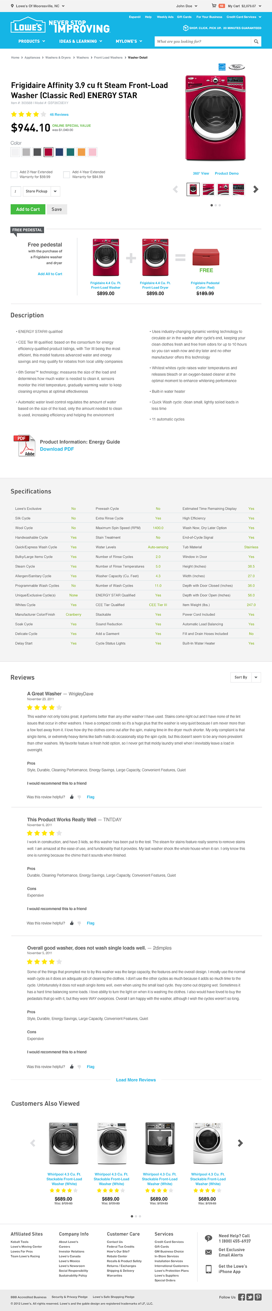
Product Detail Page
From there, I moved on to the product detail page, the most complicated of all the pages, because it offered the most opportunity to demonstrate the highest number of patterns, including headers, ratings, swatches, buttons, drop downs, callouts, tables of information, and carousels. The detail page included many variables, and would need to be incredibly flexible in order to support multiple user scenarios.
The existing page was cluttered and had too many unnecessary elements that made the important information hard to read, and the hierarchy of the page was not conducive to readability. The shipping information was complicated, and made the Add to Cart button nearly impossible to find.
All the product descriptions, specifications, reviews, and other important information were crammed into tabs and metrics showed that the other tabs were rarely clicked on. Add-ons and combos, such as pedestals or warranty plans were pushed to the right rail, and even the price of the item was buried.
Existing detail page
Click to view larger
Out with the old, in with the new
My redesigned version of the detail page included a full-width layout with a lot of white space, and emphasis on large imagery and typography. I used the assigned brand font DIN throughout, as well as a complimentary italic serif for a more friendly feel, and used the brand swatches as accent colors to highlight items of interest.
This new layout also allowed for the possibility of the Add to Cart button to be closer to the top of the page where it would be much more visible. Decreasing clutter, such as drop shadows, boxes, and gradients allowed important items to shine through much easier than on the previous layout.
The combination offers and protection plans were now much more visible than before, and the price was no longer buried. All the content that was once hidden in tabs was expanded out into the page, so a user would simply have to scroll to view all the information that would be useful to them, displayed in rich typography and colors.
Once the user scrolled down the page, a sticky navigation bar would appear at the top of the screen, with the titles of each section of content, as well as a thumbnail image of the product, title, price, and Add to Cart button for easy access.
New product detail design
Developing a Pattern Library
After designing one page and getting approval from the leadership team, a teammate and I were asked to design the rest of the pages according to my first design, as well as a supporting pattern library. This is where things really got interesting.
After designing the detail page, I had a few examples of elements and components that worked together on one page, but the true test would be to see if these same elements would work on other templates in different configurations. They didn't.
It was surprising to me that all these elements that worked so well together on the product detail page and complimented each other and the content so nicely wouldn't seamlessly transfer over to other pages. There were issues with spacing and alignment, and some of the components that I created were too complicated to work everywhere, they required too many rules.
So, based on the things we learned from applying the styles to a few different pages, my teammate and I began fine-tuning elements so that they would work together.
For example, the form fields and drop-downs were designed to be large and tactile, so that it would be easy to click them and read the information that a user was typing into them, but when we put them next to a Submit button, they didn't align properly, and that seemingly insignificant discrepancy of a few pixels caused major problems to the whole layout of a page.

We realized that we had to choose a standard height for things so that when one element was placed next to another, everything would line up. We realized that we now had the building blocks that could be used to make whatever pattern was needed. A button and a drop-down could be combined with a gray bar to provide an action bar for sorting data.

After developing all our building blocks, we were able to fit them all together like puzzle pieces to build any template necessary, and then we categorized them into a pattern library for use by the rest of the design team. This would include a grid system, typography examples, buttons, forms, alerts, icons, ratings, and other UI elements that would be necessary for various aspects of the site. We also wrote use cases around all the elements so that they would be easy to implement consistently.
My teammate and I went on to write and enforce the new style guide.
Buttons and Links

Forms

Alerts and other UI Elements

what i learned
Design in context.
Just because something works on a blank canvas, doesn't mean it will work when you implement it on a page. Sometimes the sum of all the parts doesn't add up. You can avoid this by adding as you go.
Less is more, more or less.
Marketing folks love it when their new promotion can stand above all the other content, but when every element on the page is screaming for the user's attention, it can feel overwhelming, and it's easy for the important things to get lost. Reducing the clutter on the page means that everything gets a voice, even the things that are whispering.
"Fitt's too small, it's hard to click."
I like to abide by Fitt's law, which says that the smaller something is, and the farther away it is from the cursor, the longer it will take to click on it. We took this very seriously when we designed the new elements and components. We wanted things to be tactile and engaging. Small forms and default drop-downs feel cumbersome and heavy. Making buttons and typography bigger made everything feel much more approachable.