
The leadership at Hickory Grove Baptist Church approached me in the summer of 2012 to create a design treatment for their new objectives and direction as a church. They were going to start realigning all their programs and endeavors to be more missional in nature, stripping things down to their basic elements, and they wanted a graphic treatment that would reflect that.
Hickory Grove sent me a rough draft of their thought process around their new direction. There were 5 main ideas that encompassed everything that the church did, these were Worship, Connect, Serve, Pray, and Give. Everything fell under these 5 categories, and these were the conduit through which they would accomplish their primary objective, which was to be evangelical. It was also necessary to incorporate the strategy into the story, which was three-fold: Exalt Christ, Make Disciples, and Pass the Torch.
Sketch Session
So, my first task was to understand how all these things fit together in the overall story of Hickory Grove in a way that made sense to read and tied in with the graphic treatment. As I thought about how to communicate simplicity while still maintaining a compelling visual appeal, the periodic table of elements came to mind, so I did a few preliminary explorations around that idea.
The colors were vibrant and unique, and periodic table idea was being communicated well, however the graphic treatments were getting too cluttered, and didn't make sense without context, so I decided to try a little bit different approach, and simplify, simplify, simplify.
This was obviously a much simpler approach, but it lacked consistency between each objective, the odd number of shapes didn't really fit together very well, and the square shape just wasn't very interesting. I knew I needed stronger typography and a more memorable shape, so I began exploring shape options:


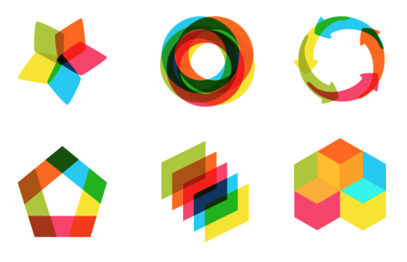
I liked the idea of the overlapping shapes, but as I explored more options, I thought about making the square shape 3-dimensional, and if you turn a cube a certain way, it starts to look like a hexagon.
“As I experimented with the hexagon shape, I found that it lends itself to a variety of interesting treatments when overlapping, as well as stacking and aligning.”
After that, I incorporated my original periodic table elements back into the shapes, and I had a strong set of icons for the objectives that could be stacked and aligned to one another, and each was able to stand alone fairly well.

From this, there were a multitude of graphic treatments that could be created to support the objectives, and when it came time to create icons for the 3 strategies, the shapes derived from the hexagons worked well, and tied the whole campaign together. They each used shapes found in the hexagon to construct an icon that was an abstract interpretation of the piece of the strategy they represented, and they were also color-coded based on the objective they most closely corresponded to.

All that was left from the original document was to communicate the idea of sending disciples through the statement "I am sent. We send." and an icon to represent that idea. I also wanted the icon to communicate the idea that this was an ongoing mission, not simply something that happens once, but something that is reciprocal. I designed the word "go" into the infinity symbol, and though this rarely happens, there weren't many explorations or iterations on this design before I found the right treatment. This one came by a stroke of inspiration, but usually, these things take a little bit more work and iteration.

Each individual ministry could could be color-coded based on the objective that they supported, and the graphic treatment of that ministry could be built out of these building blocks. Along with the new objectives and direction came a new initiative to welcome visitors to church and guide them to the right areas on their first time, both a welcoming and wayfinding mechanism. It was called First Impressions and it needed a new brand as well.

The icon in the green talk bubble was a simple solution to a complex problem. This logo had to communicate the ministry name "First Impressions" to insiders who are working in that area, but the same mark needed to communicate the idea of "Information" to those who were new to church.
So the icon is a number One and a letter "i" to tie in with the name First Impressions, but it is also a visual cue for Information that ties in with the common mental model, so that new visitors would know where to go for directions and information.

What I learned
Inspiration is no substitute for hard work.
Certain aspects of the work I did for Hickory Grove came easily, but for the most part, some of my best work came through sitting down with a sketchbook or opening Illustrator and trying different things until something clicked. Waiting around for a stroke of genius doesn't get you very far, but showing up to work and putting strokes down on paper is the real genius.
Show your work.
After I did all this iteration, I chose what I thought was the best option based on my expertise, and I presented it to the client as such. Afterwards, I showed them all the iterations I had explored, and explained what worked and what didn't, and it helped them to be able to see my thought process throughout the project. I didn't present multiple options, but I showed them that I explored all the possibilities, and they trusted that I did my homework.