
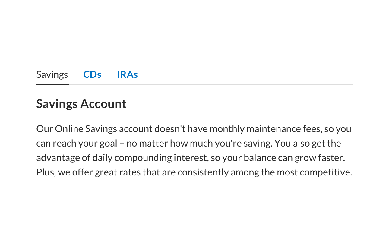
time for a design system
When I first stood up the Design Ops team, there was no design system, so my first task was to audit the existing website to find themes and patterns. I discovered that the Ally website contained 34 different button styles. It was time to build a design system.
Early on, the team would recreate designs from specs outlined in Wordpress. The first thing I did was to migrate the entire team to InVision so that they could use the Craft Design System Manager (DSM) in conjunction with Sketch. I also established tokens for color, typography, and spacing so that the developers and designers were working from the same measurements wherever possible.
modernizing the system
Standardizing the system went a long way towards cutting down on development rework and minimizing inconsistency in the experience. But after a while, we identified a pattern of feedback coming from users, as well as internal business partners that our site design needed to be modernized.
previous design
The gray background felt dark and cloudy, and the hard outlines and containers on every element made the site feel boxy. It was time for an update.

Form Elements, pre-redesign

Tables, pre-redesign
cutting corners
Most of the Ally authenticated space is made up of forms and tables. I did an audit of around 30 pages to analyze the existing design, and realized a lot of the visual clutter came from very dark borders around forms and tables, so I wanted to turn down the volume on all those harsh lines to create a lighter, cleaner feel.
We also heard a lot of feedback from customers and the business that everything felt extremely “boxy,” so I made an effort to introduce more rounded corners to soften up the edges, and soften drop shadows as well.

Before

After
form alignment
One of the major issues I wanted to address with the current design was the alignment of forms. Our old design positioned field labels on the left of the fields, which created a ragged left alignment and floated the form in the middle of the page. Links and contextual help were often placed to the right of the form field, which shortened the length of the field and created even more ragged alignment.
I moved the labels to the tops of the fields so that they aligned left with the fields, which also gave the added benefit of providing more room to allow for a more conversational approach to form fields. Instead of just labeling a field “Name” we could allow the spirited brand of Ally to come through and label the field “Tell us your name.”
I also moved helper icons inside the field so that the alignment to the right of the field was cleaner as well.

Before

After
new tables

I took a minimal approach to the design overall, and continued removing elements and borders and lines and containers to remove as much visual noise as possible.
I took special care with tables, since much of the data in the Ally experience is tabular, removing zebra striping, boxes, borders, containers, and shadows, to strip the experience down to its essential parts, to allow the content to be as scannable as possible.
I also felt strongly that the expandable rows on the table should use the same pattern as the accordions, since they functioned similarly, so I replaced the plain links in the table with accordion-style chevrons that rotate when they’re opened.
tabs
In almost every instance, if I could remove outlines and borders and still achieve the same pattern, that was my goal, in order to create a cleaner design throughout the site. Tabs are a great example of where removing those elements made a huge difference in the look and feel.

Before
After
brightening the background
One of the primary things I noticed was about the previous system was that designers were constantly putting everything into boxes and containers with white backgrounds, because the elements didn’t stand on their own on the gray background.
To solve for this, the first thing I did was to change the page background from gray to white, to make it so that designers didn’t feel as compelled to put everything into a container. This immediately decreased the visual clutter, since there weren’t as many borders and boundaries segmenting every page.
full page design
The individual components were different enough after the refresh, but the full impact of the redesign is really felt in the cumulative effect once it all comes together on a full page.
Changing the page background from gray to white allows the designer to put elements directly on the page
This leads to designers using fewer containers, so that when a container is used to call attention to the content, it’s noticeable, instead of competing with all the other elements on the page.
The alignment of the form fields and labels allows for a much more efficient use of space and layout, and much greater scannability.
Before
After
implementation
The refresh of the design was the easy part of the project. Once the actual visuals had been updated, the difficult part was to build out components in Sketch so that designers could drag symbols to their artboard and alter them with overrides, instead of having to break the symbol down in order to make it fit their requirements.
After that came the major effort of working with our React developers to build out specs for each component, thinking through all the ways each one could possibly be used, and planning for those use cases with controls on the back-end. We built the React components in such a way that one component could be used to create multiple variations of the same pattern, depending on different use cases, without any custom code. But we also created backdoors so that if, for example, a custom icon needed to be substituted, a developer could add an SVG without completely rebuilding the component from scratch.
It’s a delicate balance of creating consistency while also keeping the users of the tools in mind, so that the standards aren’t so rigid that they either can’t deliver on their requirements, or have to constantly create one-off design and code to fulfill those requirements.
I also worked with the individual agile squads and their Product Owners to develop roadmaps for when the new components would be rolled out, prioritized on which components would be coming first, while also taking into account business goals and strategic initiatives. It was a huge effort that spanned an entire year, but I’m incredibly proud of how it turned out, and of the experience I gained along the way.
a note about designers and developers as users:
This project was unique from the standpoint that there weren’t user flows and journeys, but the team of designers and developers were the users. My goal in the redesign was to address feedback we had gotten from users of the Ally platform, as well as business stakeholders, but to handle that feedback with a focus on the users of the design system itself, the design and development teams.
Just like with any other project, I conducted an audit of the current workflow, conducted interviews with design and dev, took notes on how the current components were being used, how they were being detached from symbols, or how developers were having to constantly create one-off code based on how the current components were designed.
My goal in the redesign was not just to refresh the visual design, but also to create parity between the tools UX and Development were using, and more rigid standardization of how those tools were used, without sacrificing flexibility.